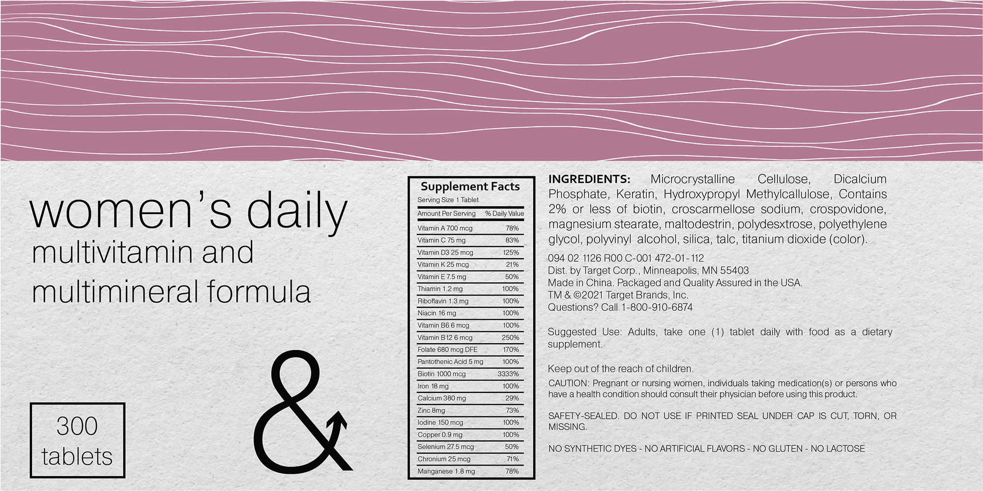
For the package redesign, I wanted to explore eco-friendly options to the excessive plastic packaging. Vitamins are a product used by many and create a lot of waste. The tube was designed with a paper/cardboard packaging to be used and printed directly on. The tube inside could contain a small biodegradable plastic pouch to waterproof the vitamins inside.
As for the print design of the package, I stuck with a neutral color for non-gendered vitamins, and went with a classic blue and blush for the men’s and women’s vitamins. For the font, I chose a simple modern sans-serif, and used it to recreate the logo to fit the new packaging. I took the original ampersand and added the arrow to represent the “Up&Up” brand.